我们接受:

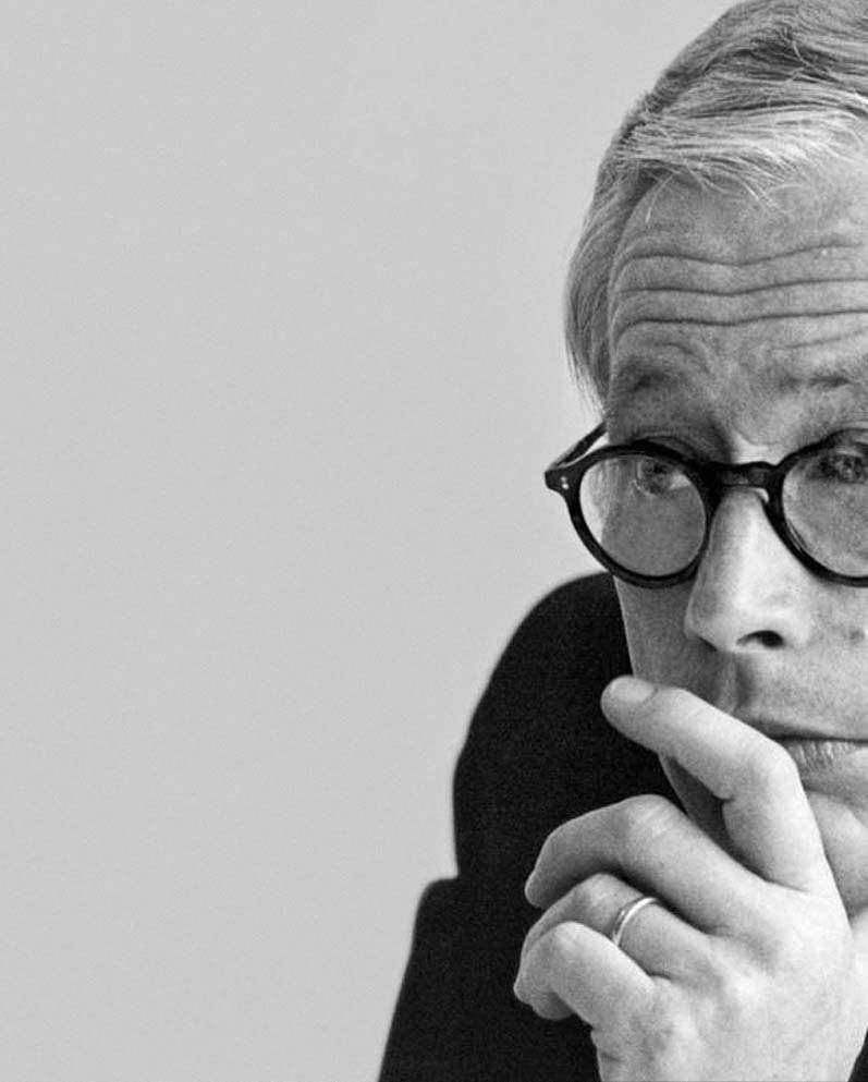
At Bellroy, design is a major part of our DNA — that much wouldn’t surprise you. But to us, valuing good design begins with valuing the experiences our customers have, and understanding the moments that make up their day — both in life, and with the products they choose to engage with. There are certain designers and brands that we admire for pioneering and upholding these values, and it’s these we consider our ‘Heroes of Design’. First in our series, we look at arguably the most influential of all: Dieter Rams.
Originally released in 1958, Dieter Rams’ T3 transistor radio looks like a lost Apple prototype. With its curved edges, stark minimalism and intuitive scroll wheel, it’s a physical manifestation of his ‘less but better’ approach to design. More than half a century later, it’s considered a modern classic. The first of many.
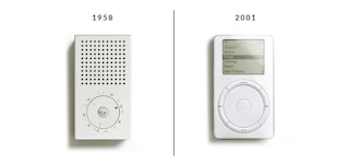
Working with Braun from 1955 until retirement in 1988, Rams brought simplicity and style to everyday objects. In the process, he created iconic designs that have both stood the test of time and shaped the world as we know it.
If they happen to look familiar, it’s because almost every industrial designer since has been influenced by his work. Apple’s Jonathan Ive is a case in point. The designer responsible for the iPhone, iPod, and iPad has described Rams’ work as, “Bold, pure, perfectly proportioned, coherent and effortless. At a glance, you knew exactly what it was and exactly how to use it.”
But what have we mortals learned from Dieter Rams?
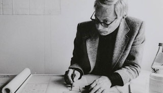
A trained architect and carpenter, Rams was influenced by the Bauhaus movement, which brought art and industry together and suggested good design was about achieving both beauty, and utility. In doing so, it could transcend its origins and influence society on a broader scale.
He introduced these sensibilities to consumer products, explaining that, “Indifference towards people and the reality in which they live is actually the one and only cardinal sin in design.”
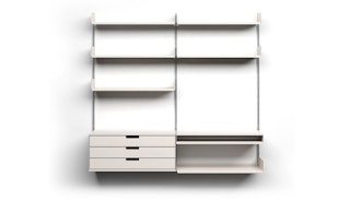
You can see that philosophy in practice via his 606 Universal Shelving System. Released in 1960 under his Vitsœ imprint, the modular shelving unit is a master class in form and function. By stripping away the superfluous and re-engineering the humble shelf from the ground up, he was able to create a timeless piece that’s as enduring and popular today as it was when it launched.
We approached our very first wallet with a similar intention. After seeing bulky wallets affect how people sat on chairs or struggled with slim pockets, we set out to reengineer the way a wallet was built (with fewer layers of leather and a new type of card storage). In all our products, the complex layers of design — built from deep consideration around the habits of our customers — are hidden from view, until they’re needed.
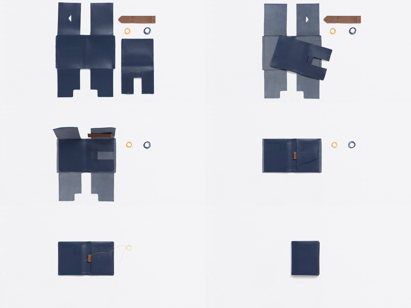
This adherence to functionalism is the common thread that links Rams’ many projects.
As he explained, “I wanted to make products whose appearance did not immediately command attention, but instead became more appealing through use and an enduring aesthetic.”
Over time, this became known as the Braun Design Process, and was centered on the relationship between interior and exterior components. The end goal was to show as little design as possible, blending these opposing forces to create a singular product.
This was a revolutionary concept in the 1950s, and it’s still contentious today. While other designers and architects were busy stamping their identity on buildings and products, Rams was trying to remove ego entirely from the process. He designed not for himself, but to serve others. That consumer-first sentiment is as apparent in his early radios and turntables as it is in the 1987 pocket calculator he designed.
It’s a humility we admire enormously at Bellroy. Similarly, we don’t consider our job done when a product is done and packaged. We’ve done our job when our products succeed in creating moments of delight for our customers on a daily basis, for years on end.
To really understand Rams’ genius it’s necessary to look at the world that birthed his ideas. Rams’ design aesthetic was very much a rejection of the consumerism and wastefulness that characterized the dawn of the nuclear age.
The more ‘expressive’ a design is, the narrower its natural environment is likely to be, and the sooner you’d tire of it. The simpler the design, the longer it’s able to serve its owner as intended.
His pursuit of long-lasting design was a natural extension of his less but more philosophy. “I always strive for things to be sustainable. By that I mean the development of long-lasting products, products that don’t age prematurely, which won’t become out of style. Products that will remain neutral, that you can live with longer.”
We think about this in terms of refining a design into the simplest form it can be before it loses its purpose. The more ‘expressive’ a design is, the narrower its natural environment is likely to be, and the sooner you’d tire of it. The simpler the design, the longer it’s able to serve its owner as intended. And, as our first goal is to ‘make products that will be loved for as long as possible’, ensuring the timelessness of our products’ appeal is crucial to us in more ways than one.
Of course Rams was there first, and he encapsulated these lessons in a series of 10 design commandments first published in 1970. Staying true to form, he later condensed it into a single, unified line: “To design is to think.”
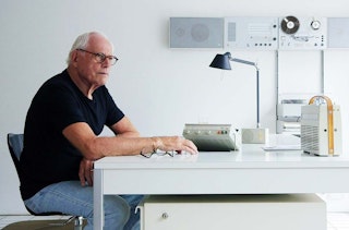
For an expanded version of Rams’ ten principles we recommend reading this Vitsœ article