Responsible Business
Recycled fabrics, and the future of sustainable practices
Straight-talking sustainable fashion expert, Teslin Doud, puts Bellroy co-founder, Andy Fallshaw, on the spot.
我们接受:
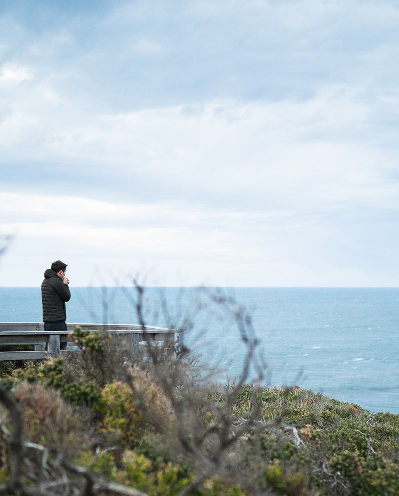
Nothing comes too fast at Bellroy. We like to think it’s just fast enough – to design products that resonate with where people are at in their lives now, but are also backed by a lot of consideration, learning and insight. Here, Bellroy’s co-founder Andy describes the milestones that informed the design of our Apex Backpack, which he started gathering nearly 10 years ago! Over to you, Andy...

Some cravings seem to appear at birth, while some arrive later in life. For me, my travel bug took seed with my sixth birthday present – a shitty discount BMX that, to me, sparkled like a genie’s lamp. It was a present that changed everything, taking me from an appendage on my mother’s leg to a kid that my parents rarely saw. I was gone – wanting to experience every part of this world.
In hindsight, it feels inevitable that I’d end up in ‘carry.’ The less friction and encumbrance we have, the more freedom and exploration we can nurture. My carry career started as a freelance designer while I was studying product design and engineering at university. I was drawn to bags and travel gear, so started working with bag brands to help them rethink carry from first principles. I convinced one brand to better consider backpacks for urban environments (and not just rugged hikes), and then the next brand to develop products that offered solutions to every part of a surfer’s reality (which included airports and tropical downpours – not just blue skies and van life).
These were my formative years in understanding carry that can adapt to anything the world throws at you.
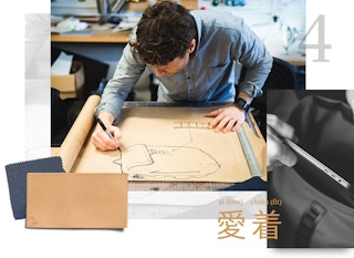
In the decade since, I have been searching for the kind of carry unicorns that could serve both my functional and emotional needs. John Maeda often speaks about the Japanese concept of Aichaku – or ‘love-fit’. He describes it as a sense of attachment one can feel for something, where you love it not just for what it does, but for what it is. Through both Bellroy and Carryology, I have been on my own journey to understand how products fit in our lives – and how they can come to mean more to us than the thing that was designed to do a thing... that's aichaku.
There are four key moments that most influenced the design of Apex. I think of them as milestones in the search for aichaku... because each has helped shape our final design, as well as me as a person.
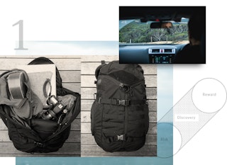
It was here that I learnt you can have many modes of access, without compromising the overall design.
In January 2013, I was holidaying with my family in Byron Bay, a beautiful surf town on the eastern most tip of the Australian mainland. A few days into the trip, I was carrying boardshorts, a camera, my laptop and several random extras I’d picked up (such as a fun ukulele I’d spotted for sale). The pack I was carrying (a Camelbak Tri-Zip – a design licensed from the Mystery Ranch 3-Zip design pioneered in the early 2000s) swallowed it whole, which was impressive enough. But then when I needed my dSLR in a hurry (kids do the darndest things!), it magically parted to let me grab the camera from the base of the main compartment in a snap.
Before the 3-zip design, you typically had to choose either a burly pack, or a convenient-to-access pack. And I believe great carry is as much about access as carrying ability. External pockets help with items you need on the go. Internal sections are best for items needed at destination. But it was the 3-zip that taught me there are many sub-modes between those two, and a great design can hold them together cohesively.
When a single product can help you transport a ukulele, retrieve a camera in a hurry, and still know you have room for all your everyday carry items, you’re onto a good thing. We wanted to achieve this same freedom with the Apex Backpack, which is why we designed it like a traditional top-loader pack, but added the option to peel it open further along either of the long front zips, or even unzip the front entirely to create radical access*.
(*If you really want to geek out, there are second zip-heads at the base of each front zip, so you can sneak access to contents at the base of your pack without opening the main points.)
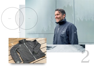
It was here I learned, with a sleek black rain jacket, that subtle performance increases optionality.
I’ve always had a performance jacket fetish, as I guess many softgoods designers do. And until the last decade or so, if you wanted performance, that meant you probably needed to look like you’d just stepped off the Everest steeps.
In 2015 I was lucky enough to acquire an Arc’teryx Interstate jacket (which, five years later, still feels sublime). To understand the response I had to it, you first need to understand the jackets that had preceded it. If you wanted an urban performance jacket, it probably drew from military aesthetics – obvious pockets, heavy Gore-tex and taping, and a loose fit for mobility.
The Interstate has the protection, pocketing, and mobility, in a slimmer fit – and its aesthetic slides under the radar. So you can dress it up or down, pack it or adventure in it.
In my search for ‘more, from less,’ the Interstate gave me three jackets in one, with the weight of half a jacket. As I zipped up to cross the soggy city for a work meeting, I felt right at home among the skyscrapers and polished concrete. This was a jacket that could flex through diverse environments without ever feeling forced.
While ‘expressive’ products give us a short-term emotional lift, subtle products pass the test of time. We realized the best way to balance this tension on the Apex, was by combining a restrained external with a delightful interior.
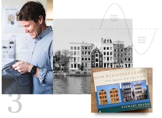
While thinking about physics and the interplay of mental models, I realised that there is a fourth dimension to design – time – and it’s the hardest to master.
When I was 17, my dad gifted me a book called How Buildings Learn: What Happens After They’re Built. The core theme is that even with apparently permanent structures, you help them adapt and change to serve emerging needs.
The concept has stayed with me since, but often in the background of my mind. Late one evening, having just arrived in Amsterdam, I was thinking deeply about how Bellroy products should change and evolve with a user’s needs.
I started thinking about how physicists typically use four dimensions to describe an object in space – some form of length, width, depth, and a point in time. And while most product designers are focused on three-dimensional design, the real magic happens when you can interweave that fourth one (time).
Designing for time encourages a more holistic (and less egoistic) approach – where you’ll leave space for the user, letting them push and shape the product according to the way they want to use it; you might prioritize materials that have already had a useful life, up-cycling them to start a new journey; you can create products that move through a user’s day, looking appropriate the whole way through; and you’ll design products that can save a user time in how they transition between activities with greater ease.
My favorite designs leave space for the customer to write their own story into them. For the Apex, we needed features and organization that was versatile without being too prescriptive (so we didn’t load it up with excess pockets). And we wanted materials that aged beautifully, writing your history into the patina (hence, leather down the straps).
It was here I realised the best designs free your attention for the things that really matter.
So, how is my aichaku search evolving?
Unsurprisingly, what I look for in a product is evolving as my own sense of self evolves. I now spend less time thinking about my own experiences, and more time trying to improve other people’s experiences. Whether it’s introducing my kids to the pursuits I’ve loved, or working on ways to assist some of the world’s most neglected, I want to spend more time in service than I do in self-service.
Increasingly, products resonate for me when they can disappear from my attention. When I can have fewer things that do more, I can shift my attention to my work and pursuits, rather than the products that enable these.
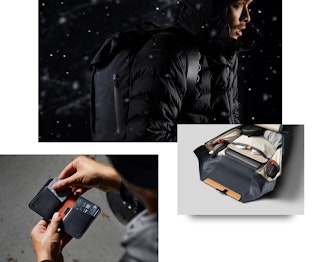
Our Apex Backpack is our most significant attempt yet to capture this desire. We wanted a backpack design that would unite each of the previous insights – to be broad and fluidly competent, while bridging past and future contexts. But then we also wanted it to serve the user so well that they can start to ignore the product, knowing it will adapt intuitively to anything they ask of it.
Because we’re still early in our own evolution, I’m sure we’ll continue to learn from this backpack as we take it into the world with us. But we feel we’ve made a compelling start, that can hopefully serve a small group of people aspiring for the same.
I now feel aichaku as a sense of gratitude for the products I can confidently ignore, because they let me focus on everything else I want to be focused on.
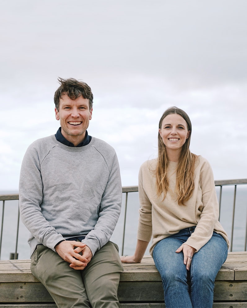
Straight-talking sustainable fashion expert, Teslin Doud, puts Bellroy co-founder, Andy Fallshaw, on the spot.
Bellroy in 2020 is a remarkably different business to when we sold our first wallet in 2010. Our co-founders, Andy and Lina, share their thoughts on the journey that's been - and the best that's yet to come.
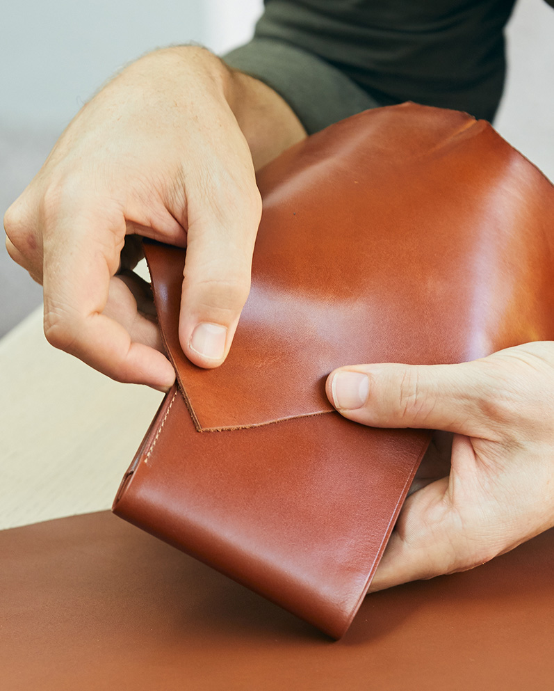
Leathers are not created equal. We've invested time, money and plenty of hours into sourcing the best leathers we can, and here's some of what we know about them.