Design
Simple is back, in a massive way
'Simple' isn't very simple at all. Here, we look at the simplicity in product design that comes from solving complexity.
我们接受:
Scandinavia is known for its pragmatic design philosophy. Whether it’s a classic Nokia 5110 mobile or a Volvo 240 sedan, the products are efficient, durable and stylish. That universal appeal means they often blur the lines between income, social status and lifestyle.
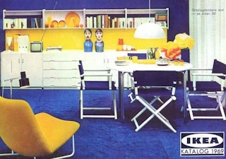
IKEA embodies that spirit better than most, a brand that’s just as likely to be found in student share houses and family homes as offices of tech start-ups or design agencies. The reasons are many, but there’s one that stands out to us: IKEA understands that design can be a great equalizer; that good design should be attainable for the masses.
Launched in 1943 as a mail order company by 17-year-old Ingvar Kamprad, IKEA’s early days were modest, but the seeds of its global success were already taking shape.
Kamprad was influenced by the Bauhaus philosophy of beauty and utility. He believed that everyday products could bridge the gap between art and commerce. So, when he started selling flat-packed convenience to customers, he wasn’t just updating decors, he was offering modernism on an industrial scale.
More than half a century later, that philosophy continues to furnish homes around the world. It’s so ingrained in everyday life, we rarely stop to think about the process behind an IKEA lamp, office chair or sofa. But the reality is it’s a complex journey from initial design idea to finished product. The Bauhaus school provides a roadmap for that journey, and it’s one that has always resonated with us here at Bellroy.

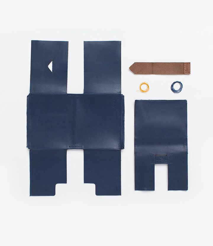
We believe that good design is an integral part of everyday life, that products can be both functional and beautiful. But more often than not, it’s the intangible design elements that bring a product to life. Those decisions that form what’s on the inside, the way a product performs, the way it feels, the way it lasts. The design of our Notebook Cover is an example. The silhouette may be simple. But each curve and cutaway serves a very specific purpose for the way the cover functions – on its first day of use, to its thousandth day.
The shaping at the spine means that, as the leather wraps around your notebook, it won't bunny ear at the ends. The card slots on the inside of the cover are angled, so that your cards won't snag as you slide them in. Each decision for the form is directly inspired by the function we hope to serve, and as it all comes together, we look for a complete and cohesive design that you can intuitively understand.
More often than not, it’s the intangible design elements that bring a product to life. Those decisions that form what’s on the inside, the way a product performs, the way it feels, the way it lasts.
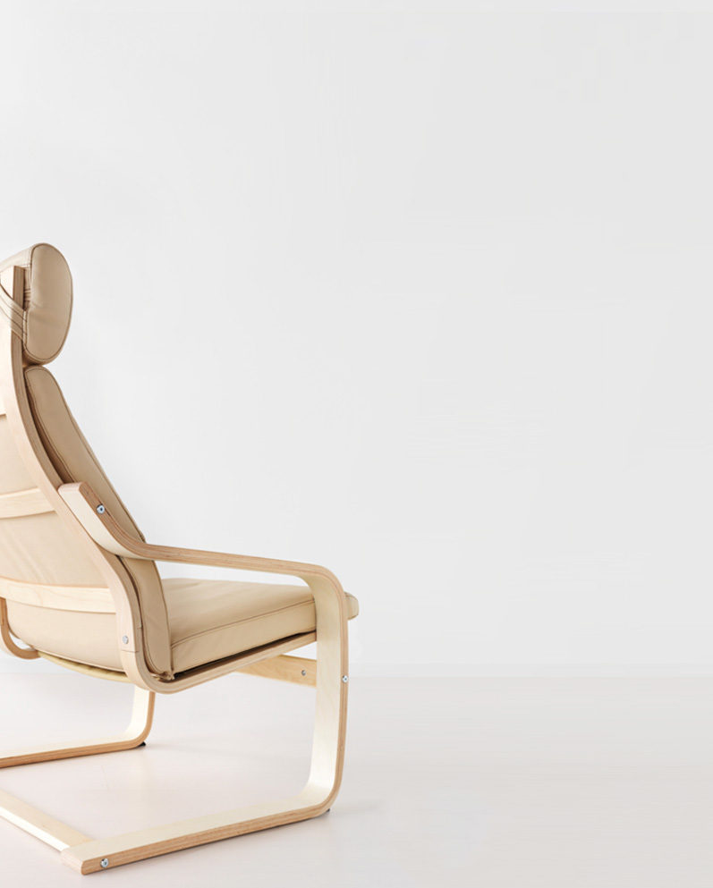
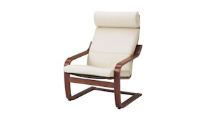
IKEA’s dedication to design, quality and price is exemplified in their iconic Poäng chair. Since release in 1976, it’s sold over 30 million units and has been exhibited in museums around the world.
If the Eames chair represents exclusivity and affluence, IKEA’s most famous product is the counterpoint. A simple, durable, and sleek classic that is available to everyone – the ideal chair for the modern age. As the original designer, Noboru Nakamura, explains: “A chair shouldn’t be a tool that binds and holds the sitter; it should be a tool that provides us emotional richness.”
By that same token, a wallet isn’t just a piece of bound leather, a notebook isn’t just a page for lists. We think about our products from a much broader perspective – how they can enhance our customers lives, how they fit into the day-to-day context, how they impact the world and environment beyond their singular purpose as a ‘product’.
Investing in such intangible elements is what helps IKEA remain one of the world’s leading brands. And completed by the simple charm of meatballs in the dining hall, or pop-up installations that create mini homes throughout the stores, the brand gives industrial-scale modernism personality and heart.
Bringing good design to everybody – families, students and businesses alike – on an industrial scale is evidence that the once fringe Bauhaus tradition is now squarely in the mainstream. And that’s what we believe ‘good’ design to be: attainable, functional and made to be loved as much on its thousandth day as its first.
Words by Mikolai Napieralski.
'Simple' isn't very simple at all. Here, we look at the simplicity in product design that comes from solving complexity.
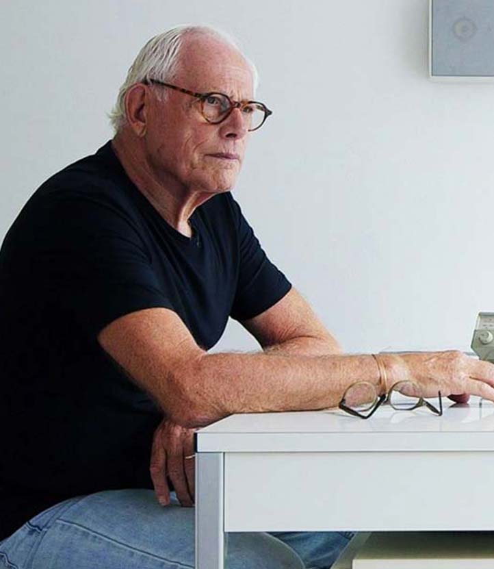
More than half a century after pre-eminent minimalist, Rams, started designing, his influence is still felt profoundly.

Designers Edition lead designer, Davin Hanna, shares his perspective on design, and the process that guides it.